After seeing screenshots from my game-in-progress, Shadowplay, Vel asked me to do a tutorial on Broken Sword style backgrounds. I kindly replied that I didn’t do Broken Sword style backgrounds, but if he wanted me to, I could write a tutorial on my own style. Looking at the result however, I do see certain similarities, but I won’t claim to emulate that or any other game. I’m merely trying to describe the way I work, hoping that it may inspire others to explore other styles than those established by LucasArts and Sierra.
You’ll need a scanner, a paint program which uses layers (the tutorial is written for Adobe Photoshop), a set of artist’s pencils, and preferably some good quality paper. You won’t really be able to tell the difference once it’s on the computer, but while working with it, a heavy stock will prevent the paper from creasing or tearing when erasing, and you’ll do a lot of that while drawing a detailed background. For quicker sketches such as dialog pictures you can use ordinary printer paper.
First you draw your background in pencil
I’m aware that this is a bit like that old Steve Martin joke where he says “I know how you can make a million dollars, tax free!” He looks out over the audience, and then says, really fast: “Okay, firstyougetamilliondollars. Then…”. But it isn’t really all that difficult. It doesn’t have to be naturalistic. What’s important is to find your own style, and stick to it throughout the game.
Make sure the composition is interesting. Distinct fore- middle and backgrounds create depth. Unusual angles can help the atmosphere – a low angle makes a castle seem more imposing, a high angle makes a Kafkaesque player character feel small and insignificant. Generally, you shouldn’t use angles over 30 degrees unless you take the perspective into consideration when drawing you character art. Always keep your exits visible and create focal points around elements important to the story or gameplay by using lines and areas of blank spaces to guide the player’s eye.
When drawing, there are a few technical rules of thumb:
- Use thicker lines for the foreground objects than the background.
- The background should have less detail than the foreground.
- Don’t do too much shading, save it till the coloring. What you should do however is add texture to surfaces (e.g. add grain and knots to the boards of a wooden building). Just don’t overdo it.
The example background
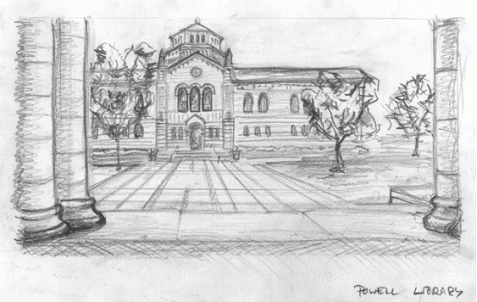
I’ve chosen a real world location, the Powell Library at UCLA, one of many Los Angeles landmarks appearing in Shadowplay. Showing the building as well as the square in front of it was a bit of a challenge in the narrow aspect ratio I’m using, and working from reference photos made the building more detailed and cluttered than if I’d designed it from scratch. Still, I found it important to stick to reality. And while it’s not the best of drawings – the less said about the perspective, the better – it’ll fit our purposes.
The original drawing scanned.
The columns in the foreground frame the main subject. This is a classic LucasArts approach, silhouetting objects at the edges of the screen, although often closer to the “camera” than here. I’m drawing the building just off-center to create a bit of tension. For the game, I’m going to add some students walking and bicycling past, which explains the rather dull straight-on angle.
Adding some color
Scan the drawing as a grayscale image at 300dpi, not more, it would be a waste of resolution and only slow down your CPU. Make your drawing the topmost layer and set its blending mode to “Multiply” with 100% opacity. No matter what you do, this should stay on top. If the drawing has become a bit smudged and the white areas aren’t exactly white anymore, you can adjust the contrast. Don’t set it too high though, or you’ll lose detail.
Create a new layer underneath it with “Normal” blending. This is where you’ll be working. Use the “Polygonal Lasso” tool to select an area to color, and fill it with the Paint Bucket or Gradient tools. I recommend gradients even when working with uniformly colored areas. Just a slight variation in tone adds texture and depth to the image. And for shaded areas like the columns in my drawing, gradients are a godsend.
The main rule for coloring is to keep it simple and fill as large areas as possible with a single color or gradient. BUT, whenever two surfaces of the same material meet at an angle (the octagonal tower is an example of this), or appear next to each other but in different planes (this is the case with the two wings of the library), they MUST be of slightly different shades. With angles, it’s a matter of defining the light sources of the room and shading accordingly. Consistency is vital here, and you certainly shouldn’t follow my flawed example. With depth planes, the surface furthest away should be a bit darker than the one in front (and if very far away, bluer in tone due to the atmosphere).
Why we love layers
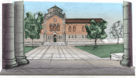
Now, work your way through the drawing, coloring all major areas. Don’t worry about details yet. Use separate layers for each element. In my example, I had layers for the foreground, the sky, the building, the trees, and the ground. By now there should be very little white paper showing through. It’s beginning to look like a real background, but something is wrong. It seems flat for some reason, like a kid’s drawing.
After basic coloring
Time has come for two special layers, which really add life: Detail and effect.
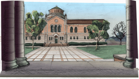
The detail layer is where you color and enhance the details (duh!) of your drawing, possibly adding things which weren’t in your original. If you’re tempted to draw something with the paintbrush or airbrush tool, by all means do so. Personally I prefer using fill tools while in zoom mode. The trees caused me much trouble until I stopped trying to paint the foliage and began seeing them as larger chunks of solid color instead. It’s also in this layer (or rather, in a separate “building detail” layer) that I darken the windows and add the door to the library.
Details added. Note that the trees and columns have been redone as well.
There are multiple kinds of effect layers. Most important is the shadow layer. I recommend using multiple of these for different image elements. This is a transparent layer consisting of black (or if you’re using gradients, grayscale) shapes which emulate shadows, and it goes just under the pencil layer. In my example I used an opacity of 32% (in “Normal” blend mode) for my shadows layer, but you could go as far as 50 or 60%. You can also use shadow layers to darken areas which are too bright after coloring. I did this with the library walls instead of re-coloring them.
Other sorts of effect layers are the highlight layer, which works like the shadow layer, except you’re using white instead of black (I used this on the backlit column edges), and the atmosphere layer (not used in this background), which is used for fog or dust filtering and obscuring parts of the scenery.
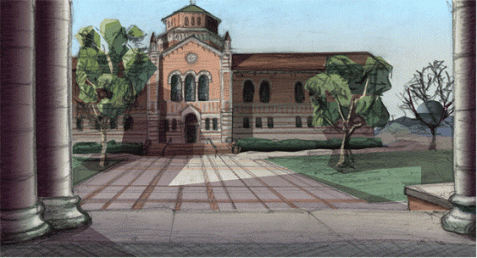
The result
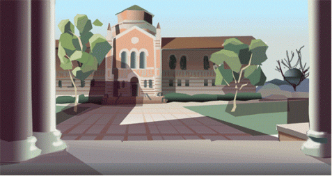
Finally, save your image, with all the layers – don’t overwrite this file whatever you do. Open a copy, flatten it and crop the image to proper dimensions, and resize it for your game resolution. You might have some minor pixel editing left to do, covering white areas shining through or removing a few misplaced pencil strokes. Trust me, it’s must easier hiding flaws now than it would have been in high resolution.
The finished background
|
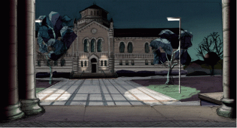
With all the hard work done, you can always return to your layered image. You can edit shadows, darken elements, adjust the contrast, and change the color balance of separate objects – without lassoing them out first. As a quick experiment, I made a night version of my background. It’s far from perfect, those streetlights are hideous and the trees should be edited for the new light, but it only took minutes. Soon I’ll go back and do a rainy day version of the background as well.
Now it’s dark
Good luck experimenting. I’d like to see somebody taking this “Multiply”-layer technique further. Maybe using ink drawings instead of pencil? Only when we go beyond the established styles of commercial adventures, in content as well as presentation, we are truly independent game designers.
– GarageGothic
Kurt said,
August 13, 2007 at 2:34 pm
Nice tutorial. It might look a bit better if you re-did your black lines afterward instead of leaving the sketchy ones in the final piece.
Maria said,
May 1, 2009 at 12:20 am
How is Shadowplay coming along.
I resently read a old copy of the inventory no.11 dec. 2003
And got realy interested in the game.
Hope you are doing fine, and the game to.
Bye from Maria